
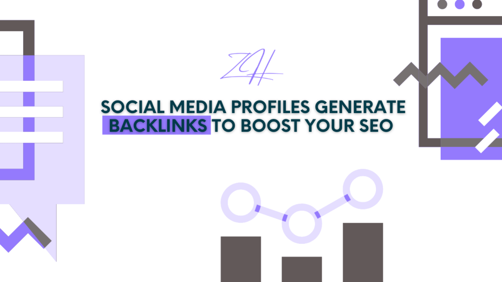
Can profiles on social media create backlinks?
Any company’s internet presence now consists mostly on social media pages. Although social media channels are not usually regarded as backlink sources, they can offer useful nofollow backlinks supporting your whole SEO plan. Social media profiles provide visibility and generally let you link back to your primary website.
Social Media Profiles Increase Visibility
Users of your social media material come across links in your profile when they engage with it. These visitors might click the link to your website, therefore increasing traffic and maybe sharing your site on their own channels.
Sites That Accept Backlinks
Links to your website can be included into your profile or bio section on several well-known social networking sites including Facebook, Twitter, Instagram, and LinkedIn. These are great chances to build backlinks straight from highly authoritative platforms.
Do Nofollow Links Matter?
Indeed, nofollow links have value. Although they generate less link juice than follow-through links, they can nevertheless drive traffic, boost visibility, and subtly help your SEO initiatives.
Using Social Media for SEO
Keeping active social media profiles gives your material chances to be shared all around the internet. There is increased likelihood of obtaining organic backlinks as more people find your business on social media.
Do Social Media Backlinks Directly Influence SEO?
Google’s Social Media Backlink Policy
Google has verified that backlinks on social media are not directly determinant of ranking. Stated differently, links from social media sites have less value than links from other websites. On SEO, however, social media backlinks are not useless either.
How Social Media Signals Impact SEO
Although social media backlinks might not directly influence rankings, they add to social signals such the quantity of shares, likes, and comments a piece of content gets. By boosting traffic, raising interaction, and improving the exposure of your material, these signals can subtly improve SEO.
Conclusion
Including social media profiles into your backlink plan might give your SEO a minor but significant improvement. You’re creating extra avenues for possible backlinks by sharing your material on various sites and referencing your website.